About Visit Korean Heritage Campaign
Korean Heritage Visit Campaign BI

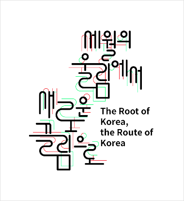
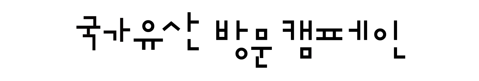
The most defining visual impression of Hangeul at the time of its creation was its distinct geometric structure compared to Chinese characters. The campaign logotype, which highlights this feature, serves as a representative design element symbolizing the Korean Heritage Visit Campaign and helps build a consistent campaign identity.
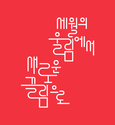
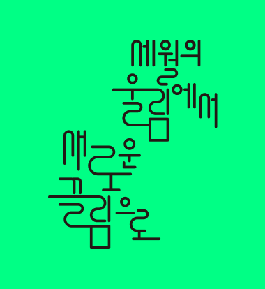
The Korean-English combined version is used as the primary format, while the Korean-only version is used when reduced legibility makes the combined version difficult to apply.

The campaign logotype, which emphasizes the geometric characteristics of Hangeul, serves as a key design element representing the Korean Heritage Visit Campaign and plays an essential role in establishing a consistent campaign image.
The horizontal logotype is used only when applying the primary format is not possible and must be scaled proportionally using the original file.
Signature
Korean-English Combined Type

Korean Type

Korean Type

Korean-English Combined Type
Primary Colors · Color Usage
- Korean Heritage Red
-
PANTONERed 032 C
CMYKC0 M90 Y67 K0
RGBR240 G53 B67
Primary Color

Black

Korean Heritage Visit Campaign Slogan
From the Echo of Time
to a New Attraction
Beyond time,
our heritage
to the world

Vertical Slogan

Horizontal Slogan
Primary Colors · Color Usage
- Korean Heritage Red
-
PANTONE1788 C
CMYKC0 M93 Y76 K0
RGBR243 G50 B63
- Korean Heritage Green
-
PANTONE7488 C
CMYKC58 M0 Y75 K0
RGBR0 G255 B133